Happy Joy
Brand Keywords
Expressive · Energetic · Cult-favorite
Industry
Snack Culture · Packaged Food
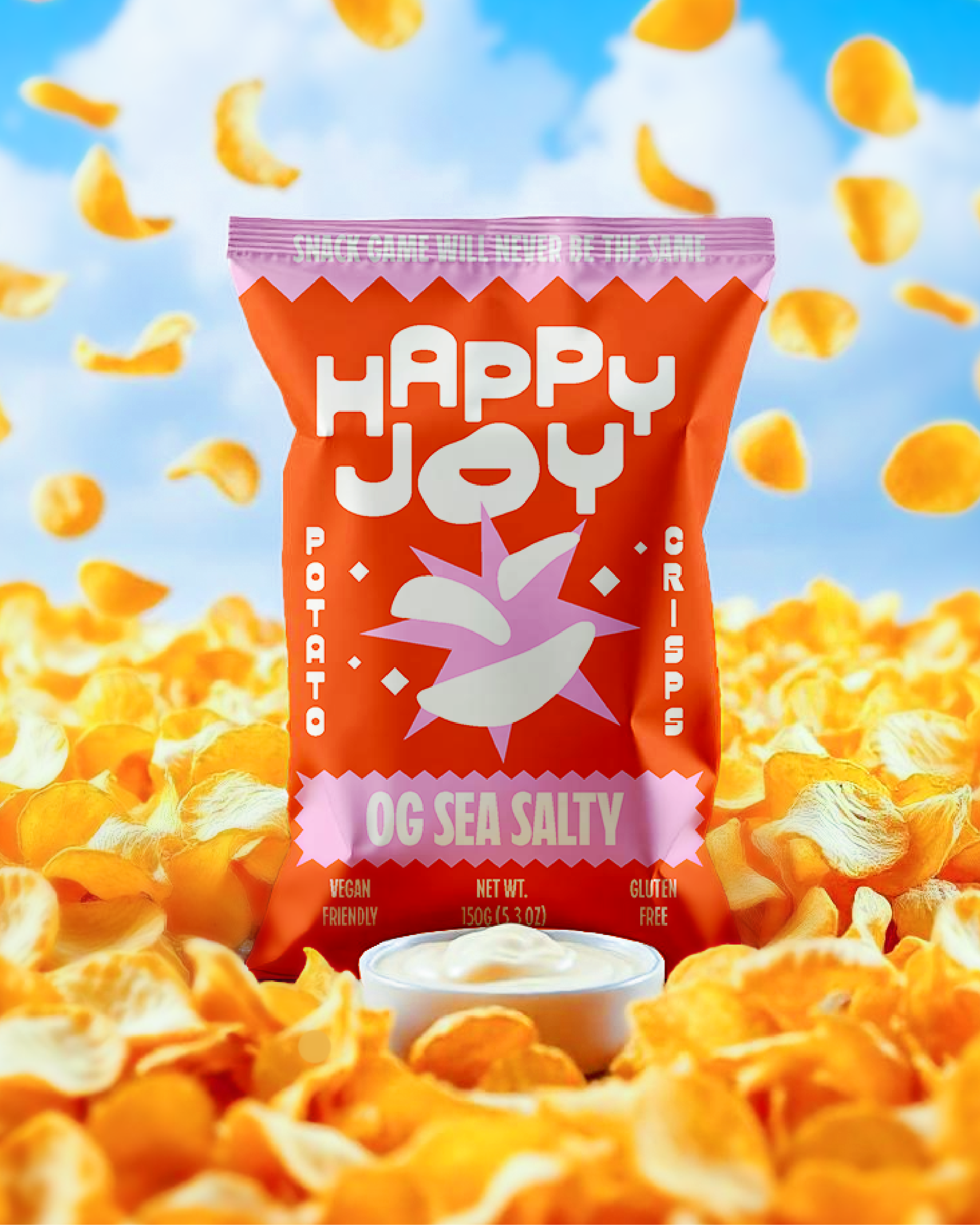
HappyJoy is a premium hand-cooked crisp brand created for snack lovers who appreciate exceptional quality, bold flavor, and an unforgettable crunch. Made with care and lightly seasoned with sea salt, each crisp delivers the perfect balance of golden crispiness and satisfying texture.
The challenge was to create a brand identity that captures the essence of HappyJoy: a snack that feels premium yet approachable, modern yet full of personality. The identity needed to move beyond traditional snack branding and build a memorable presence through bold typography, vibrant packaging, and a fresh, youthful energy.
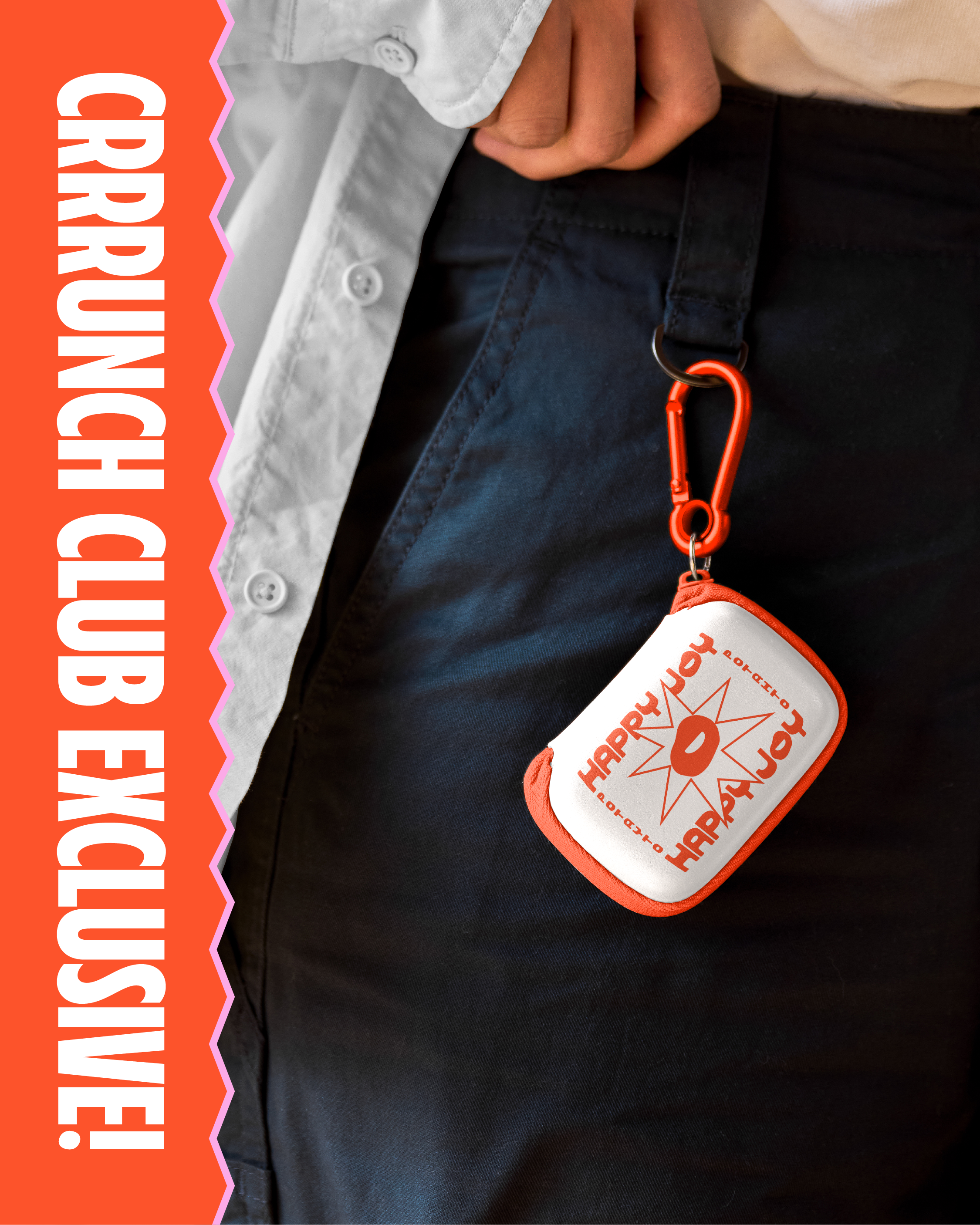
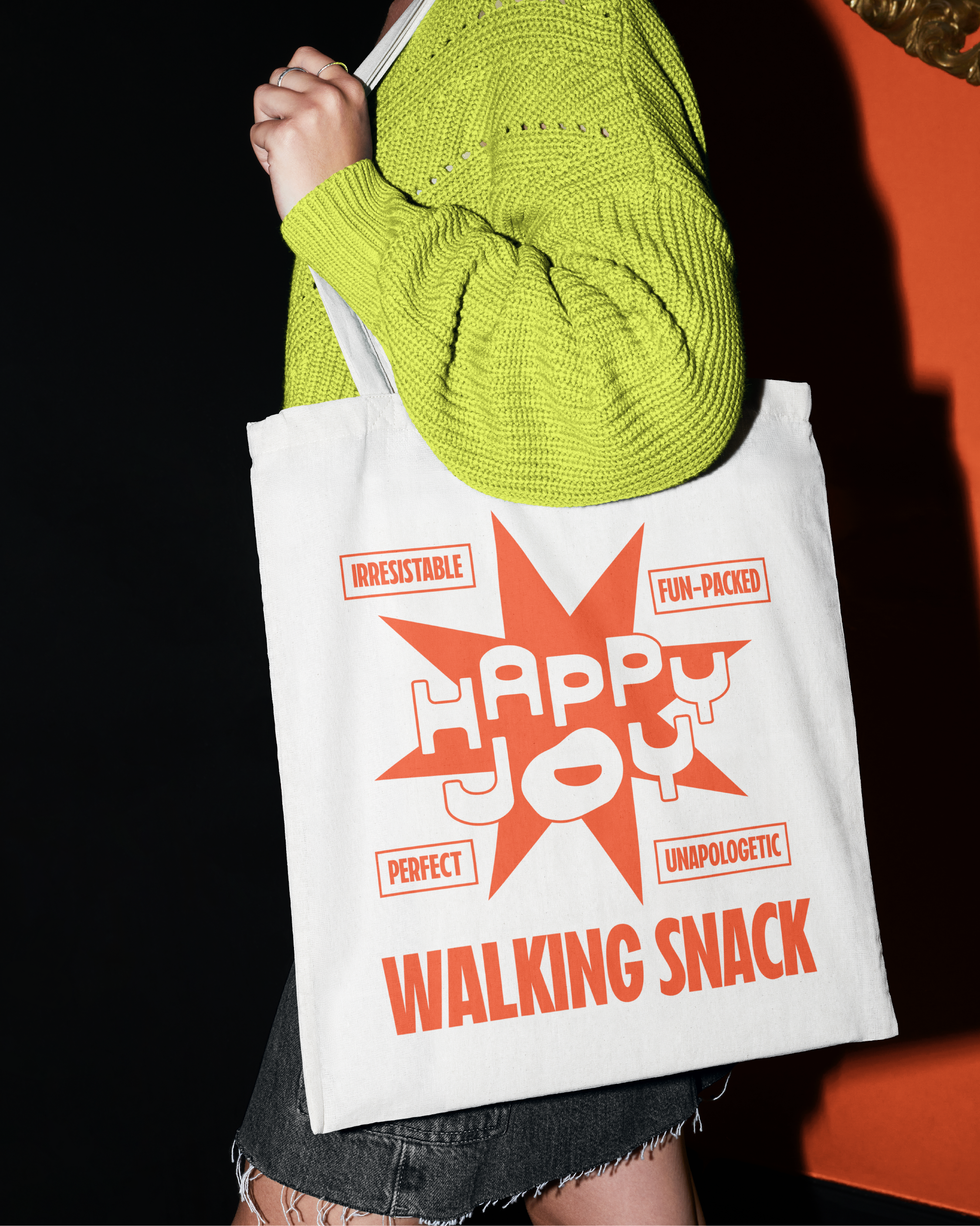
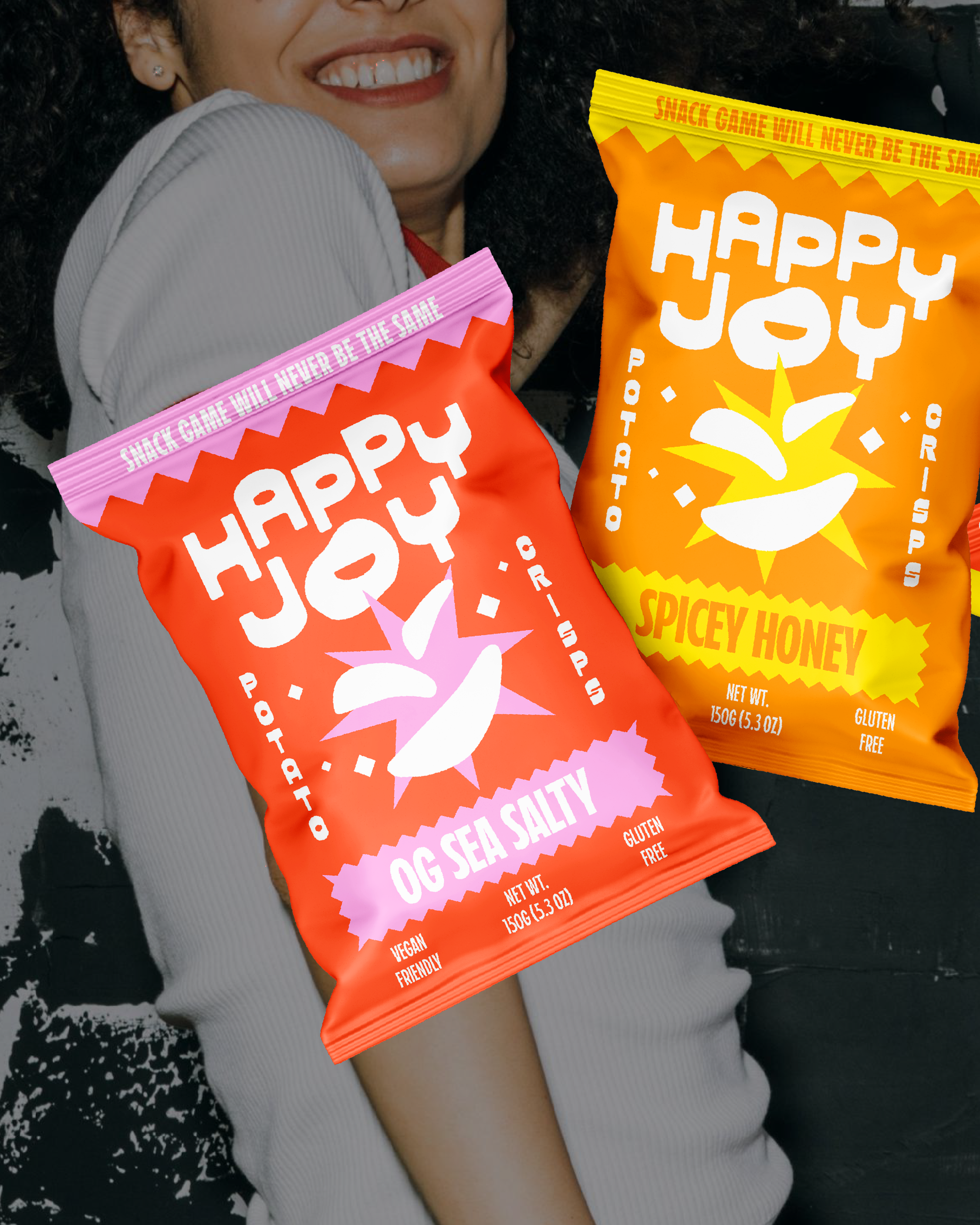
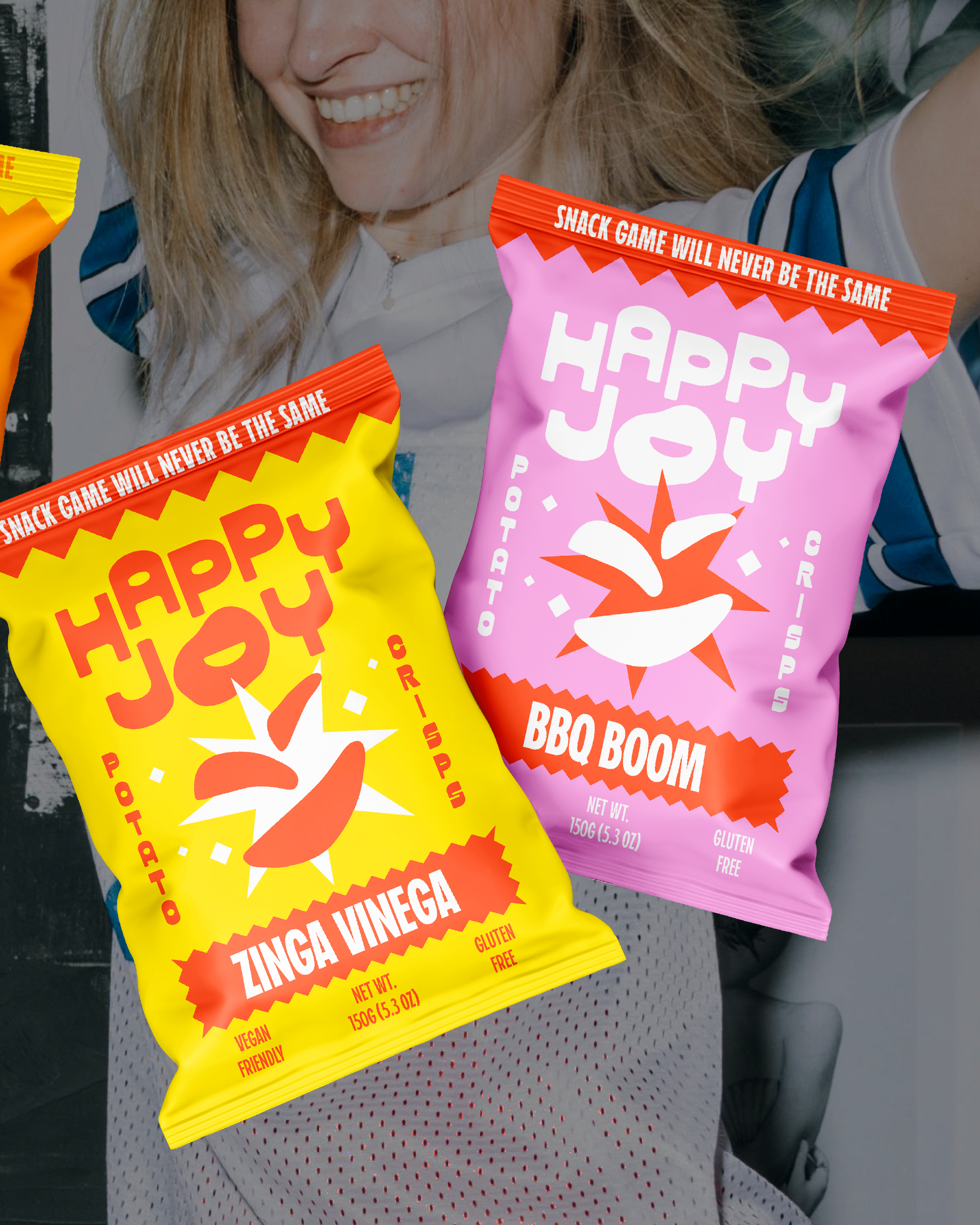
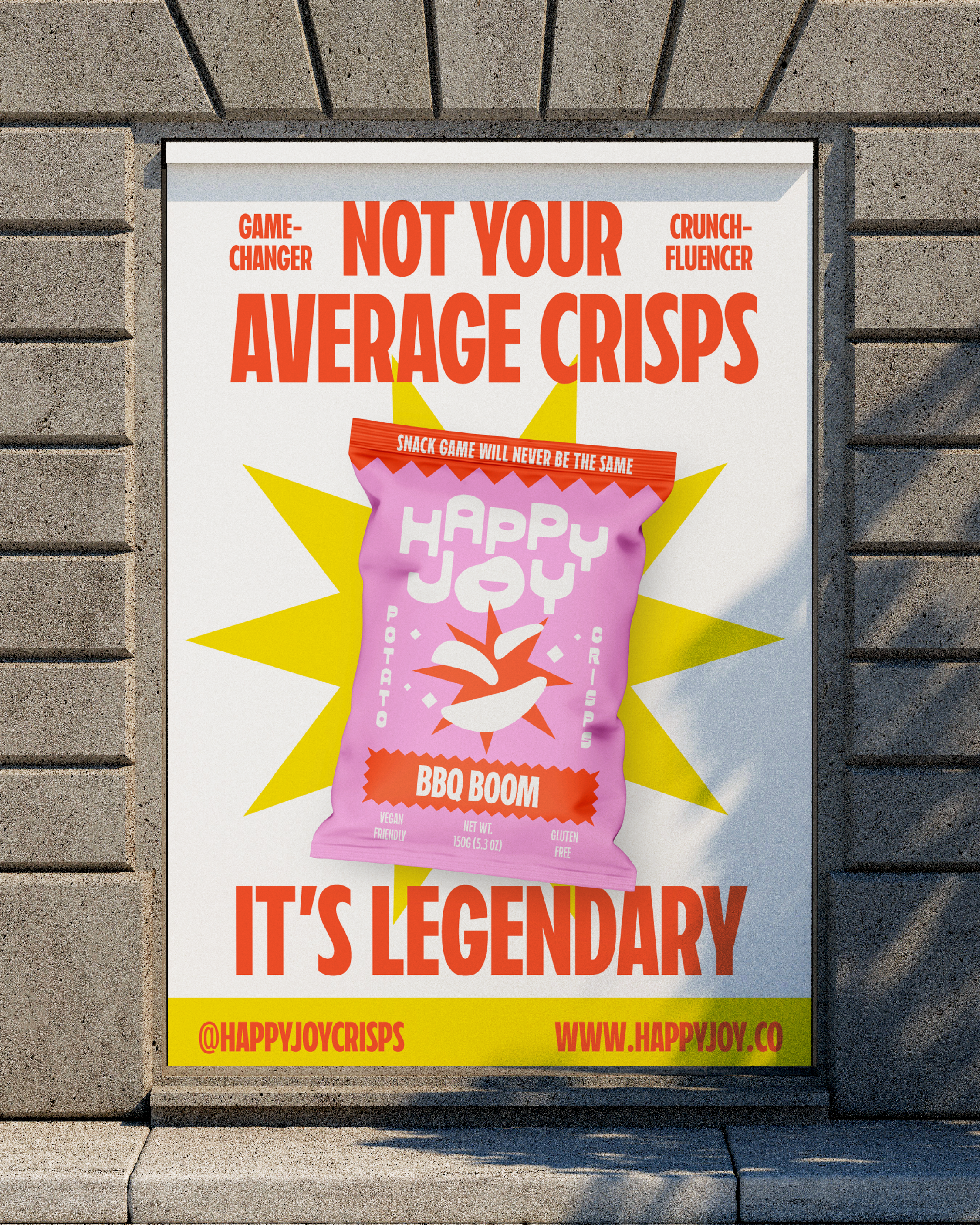
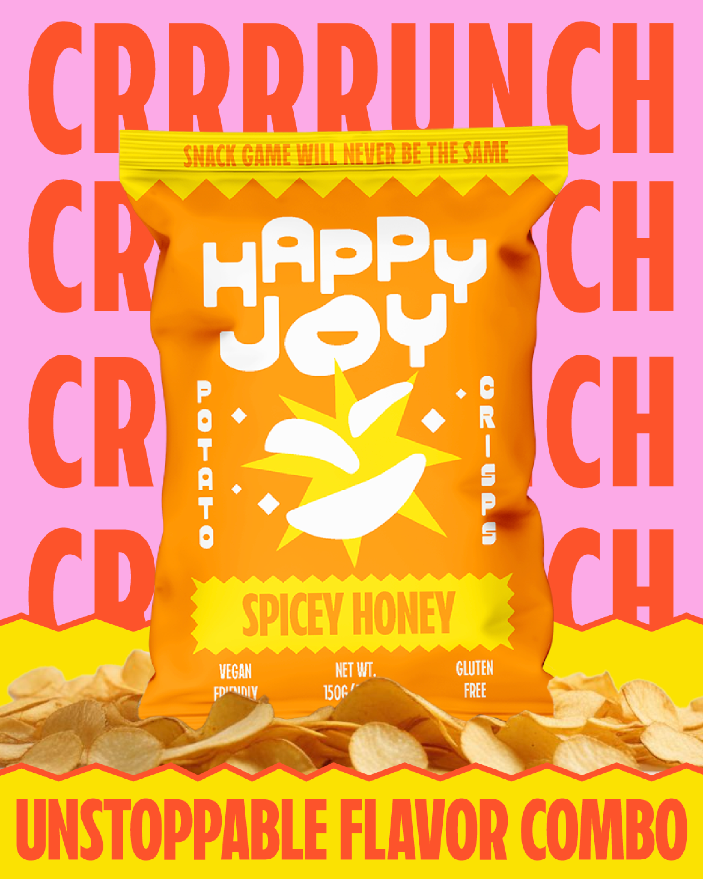
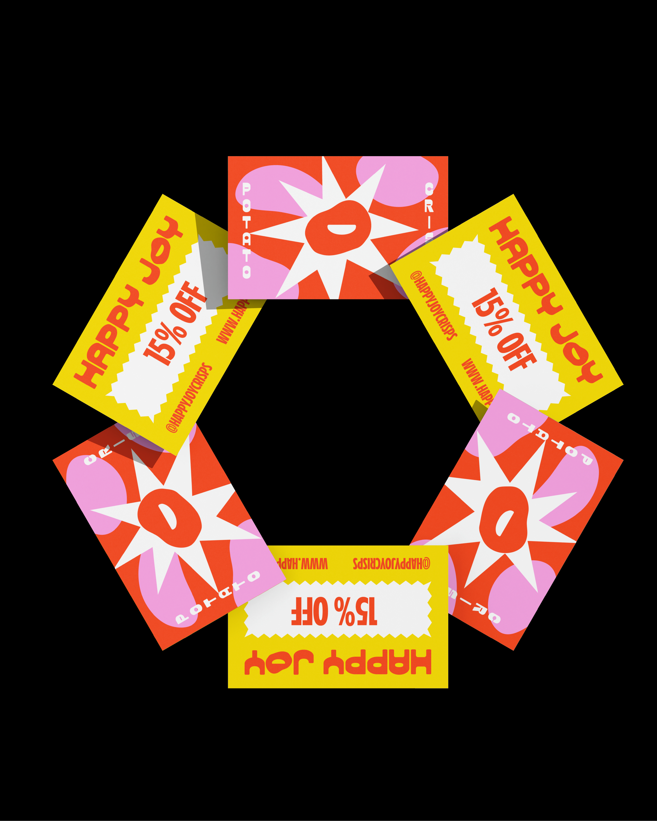
The visual identity translates HappyJoy’s energetic personality through a bold and expressive design system. Drawing inspiration from playful retro aesthetics, the brand combines nostalgic energy with a modern minimalist approach through bold typography, popping colors and dynamic compositions. The packaging feels familiar yet fresh, guarantee to stand out on the shelf, spark curiosity, and create an instant emotional connection.
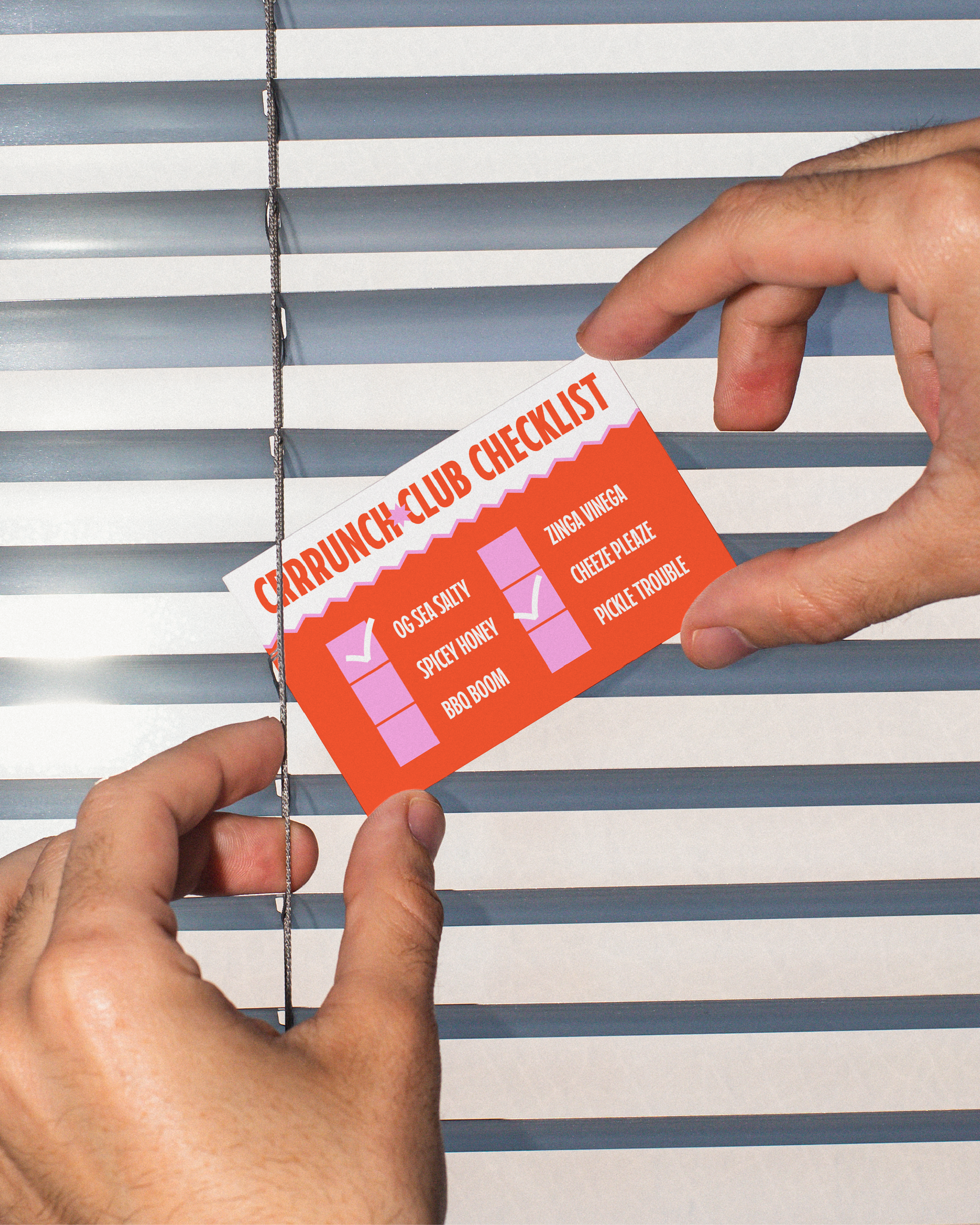
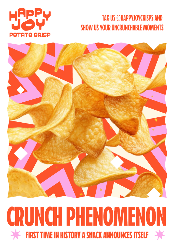
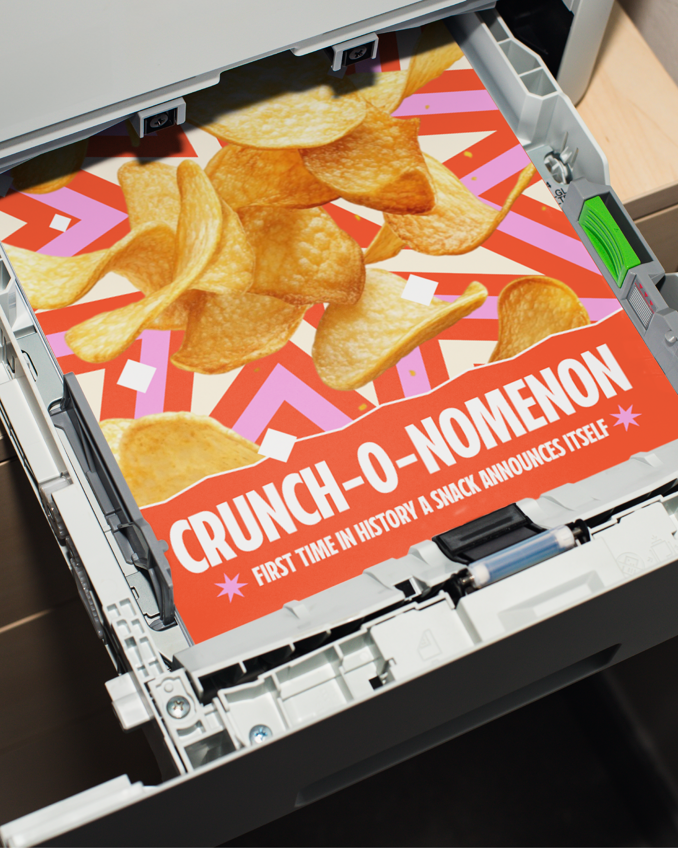
Beyond the visual identity, I wanted HappyJoy to feel like a brand with a voice: one that could walk into a room, start a conversation, and instantly bring energy to the crowd. The personality was built around a charismatic, playful character: confident, joyful, and impossible to ignore. Headlines such as “Crunch Phenomenon”or flavor names like OG Sea Salt, Spicy Honey, and other rhythmic, energetic names add personality and make each product feel like a character of its own. The copywriting works hand-in-hand with the visual identity to create a brand that is bold, expressive, and built to become a cult favorite.
-
Visual Identity, Packaging, Consumer Merch, Public Ads
-
Branding, Typography, Package Design, Stationery, Ads
-
Illustrator, Photoshop