Quiet Circles
Brand Keywords
Genuine · Playful · Inclusive
industry
Employee Engagement · Team Wellbeing
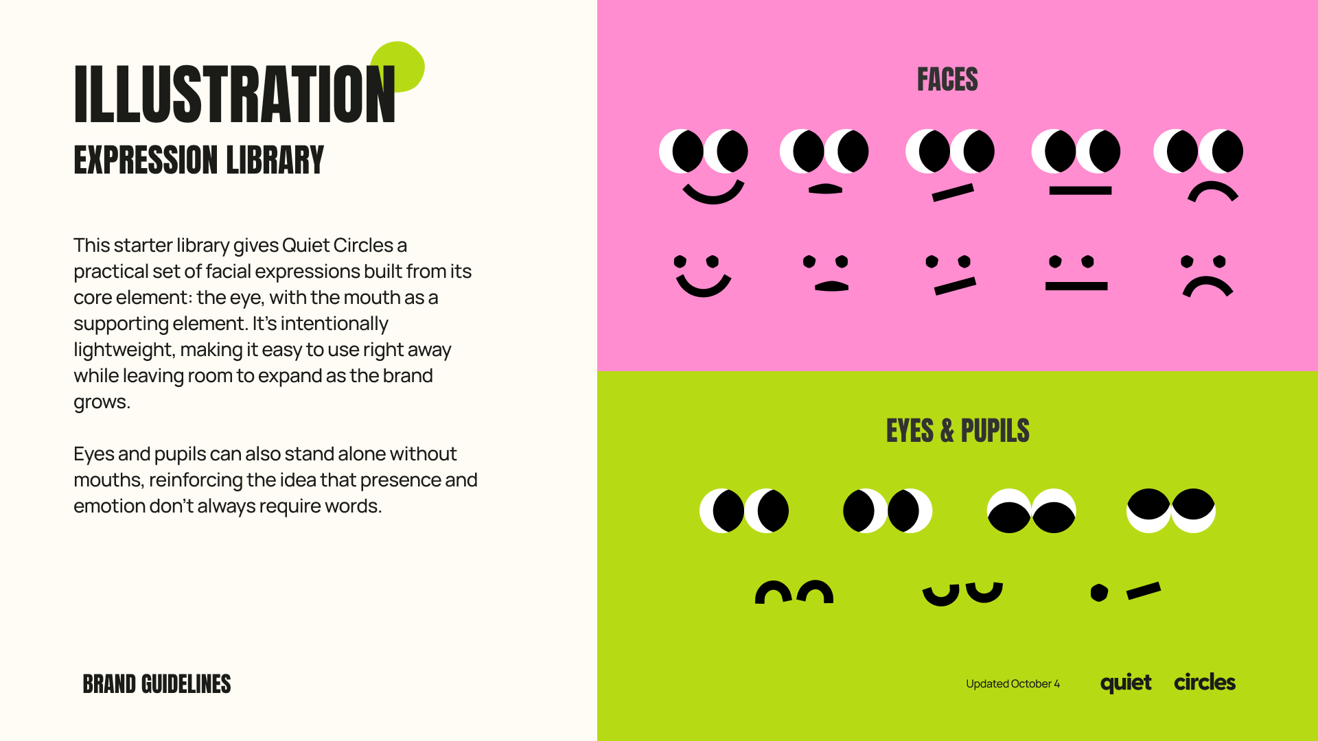
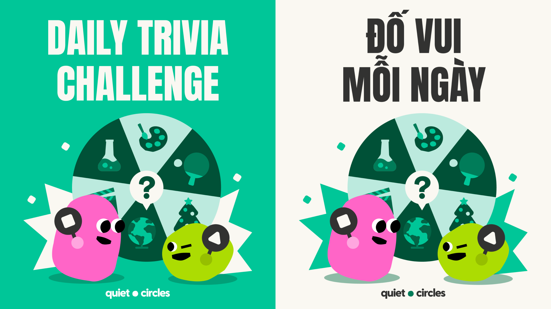
Quiet Circles is a community-focused platform designed to help professionals and teams move beyond burnout and disconnection by creating meaningful, human-first experiences. The brand focuses on rebuilding connection through simple, intentional moments of engagement.
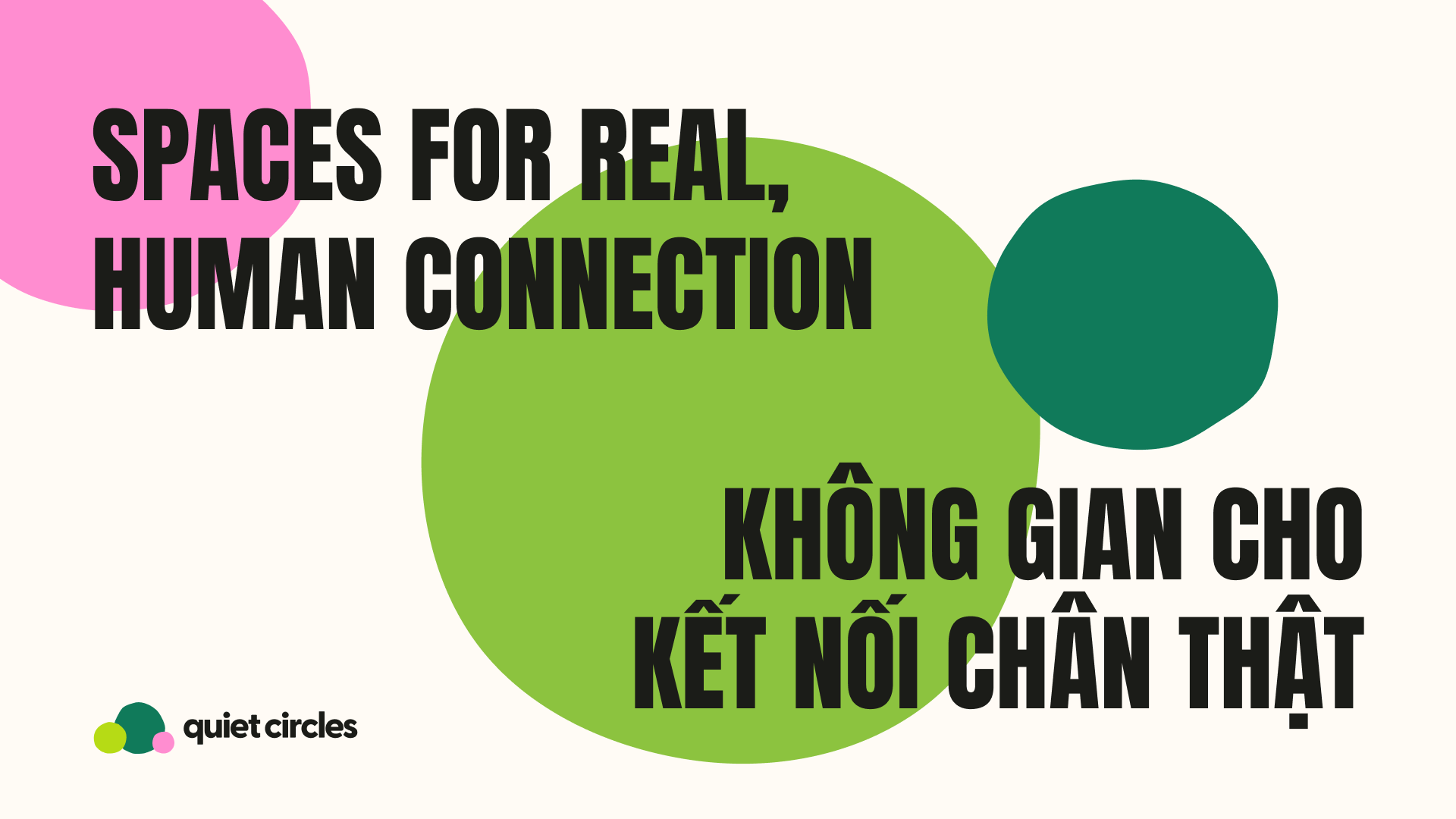
The challenge was to translate this idea of community into a visual identity that feels approachable and inclusive while balancing two important qualities: the calm, easeful nature of the brand and the energy needed to encourage participation. The identity needed to communicate that connection does not have to feel overwhelming — it can happen naturally through small, authentic interactions.
-
Brand Design, Character Illustration, Asset Illustration
-
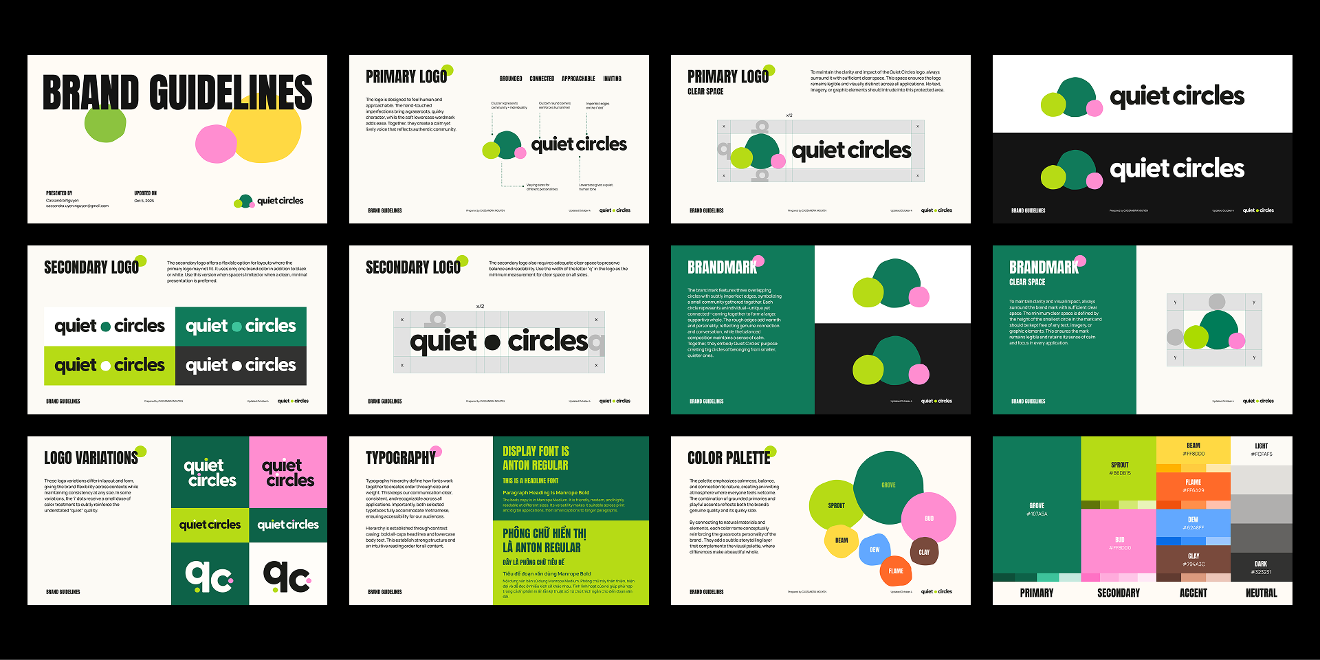
Brand Guidelines, Character Asset Library, Cover Art Illustration, Game Assets
-
Illustrator, Photoshop, Figma


Creative Strategy
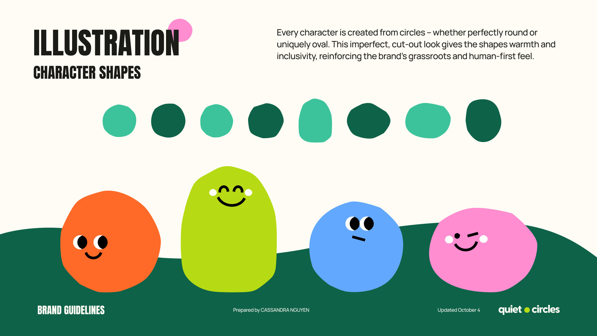
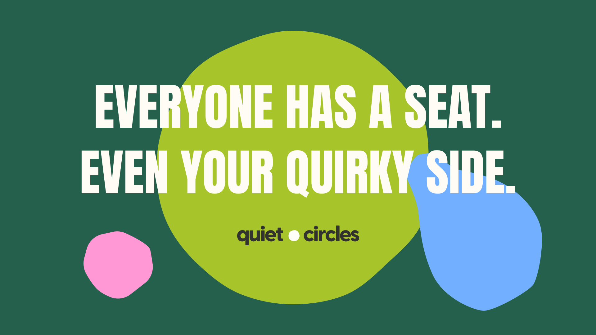
The visual direction was built around the idea of uniquely-looking circles creating a larger community. The identity emphasizes warmth, belonging, and individuality by showing how different personalities can come together while still maintaining their uniqueness.
Rather than creating a highly polished or corporate visual language, the design leans into a more human and grassroots expression – one that feels welcoming, flexible, and easy to engage with.